Understood.org is a non-profit dedicated to serving the 70 million people in the United States who learn and think differently. From purpose to tactical solutions, the organization is positioned to help individuals who learn differently thrive at home, at school, and in life from childhood to adulthood.
In 2019 the organization shifted strategy and direction. I was brought on to help oversee the org-wide branding overhaul, working directly with the ECD and CMO.
With accessibility top of mind, we started by working with branding agency, Wolff-Olins, to define the brand visually around the idea of “shaping the world for difference”. We then reached out to audio branding agency, Listen, to help mold an adaptable sound identity for the new brand.
Once all of the visual and tonal elements were created, we worked internally to establish our brand guidelines. Along with the guidelines, we developed a visual and verbal brand guide framework with distinct brand territories, which made launching multi-channel messaging easier to manage while maintaining brand integrity in unique and distinct ways.
In 2020 we launched Understood’s new brand and ambitious new mission.
Built to be Understood– Designing with accessibility in mind
To invite a new audience to Understood, the visual and verbal identity were designed to bring people in and de-stigmatize the differences they face. All the design elements were thoughtfully shaped to be accessible for all.


The new “U”
The U logo shows how differences of all shapes and sizes can impact and reform our world, bringing the strategic idea into our visual language. We used motion to optimize the user experience, using movement as a way to both express difference and to make the website more focus-friendly.
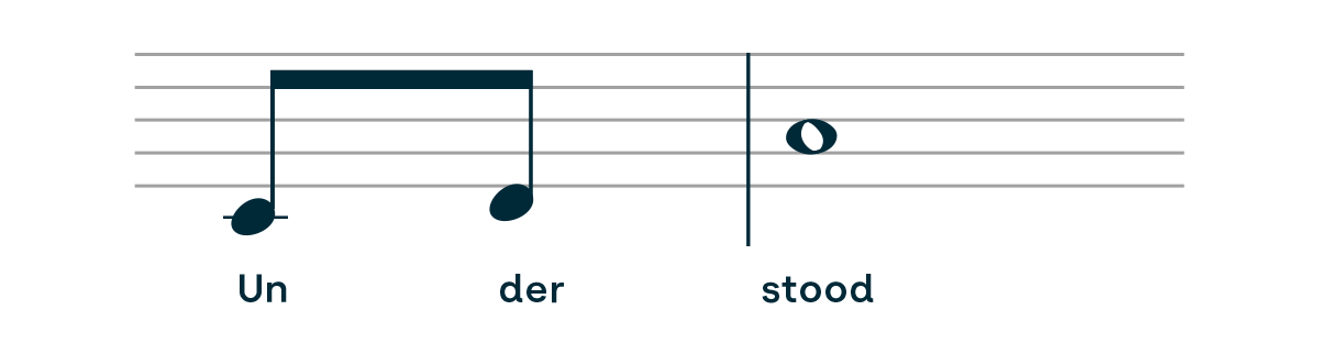
The new font
The new typeface, designed in conjunction with Martin Vácha and his foundry Displaay, was created to improve readability for people with dyslexia. The font was customized to make certain letters and numbers more distinguishable for readers.
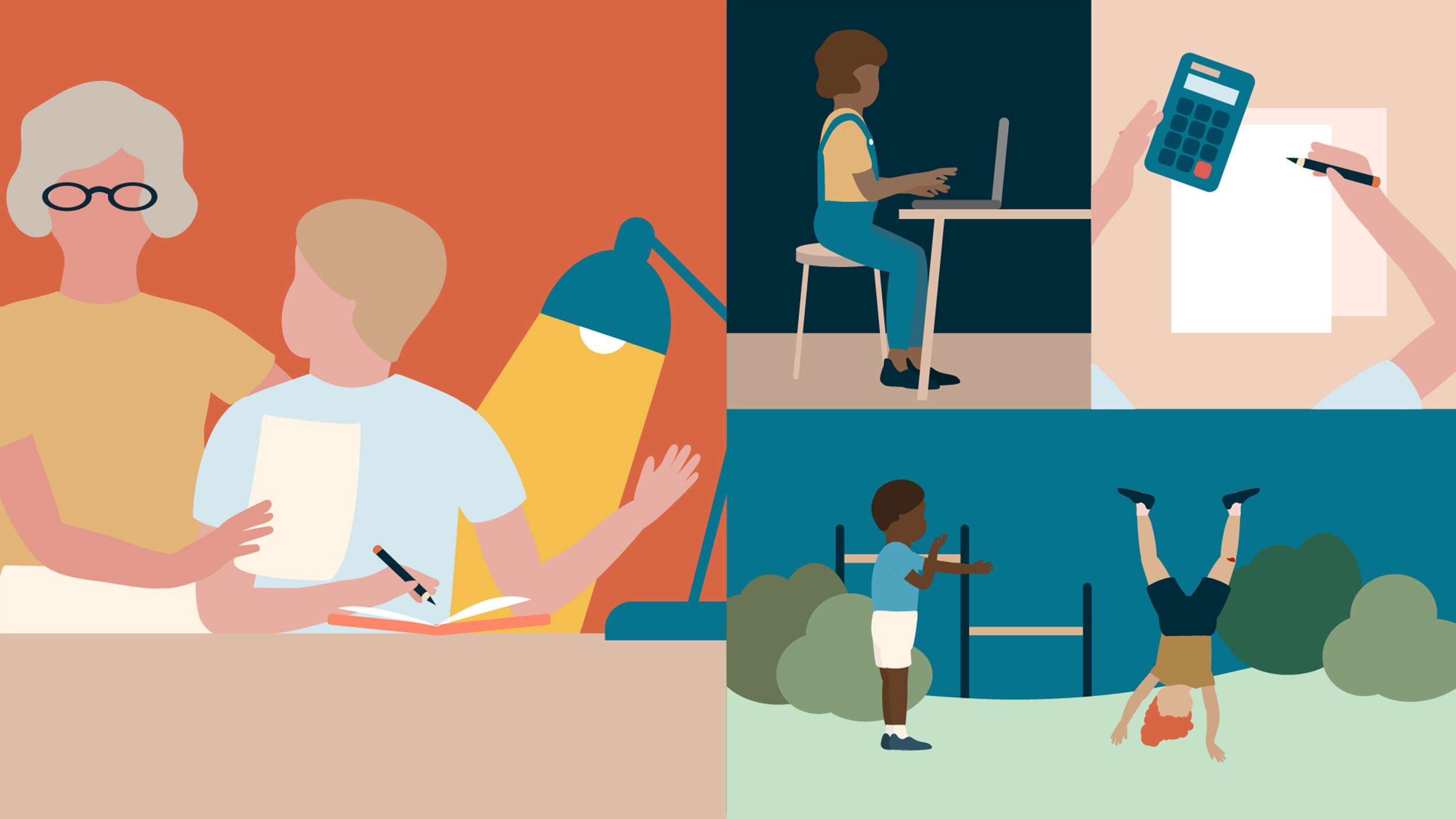
The new look
To complete our visual look, we reached out to illustrator Ka Young Lee, who created a visual library to reflect the diversity of the world we live in and show all types of people in all environments. Additionally, we sharpened their brand voice for a content-driven community, enabling writers and experts to stay on voice and write at a reading level that’s best for all audiences.
The new sound logo
With the help of Listen, we created a unique sound mark, used to distinguish our video and audio content for viewers and listeners. The new sound composition was engineered for accessibility, made from combined minimal parts that come together to form a whole. Then we developed our sound library, keeping in mind people that have sensory issues, so as not to be too jarring or overwhelming.
Rebrand announcement
We announced our rebrand on Facebook, which coincided with the launch of our Instagram account and new “Shaping the world for difference” brand video. For our new Instagram audience, we highlighted the core values of the org through a grid layout.


New brand video
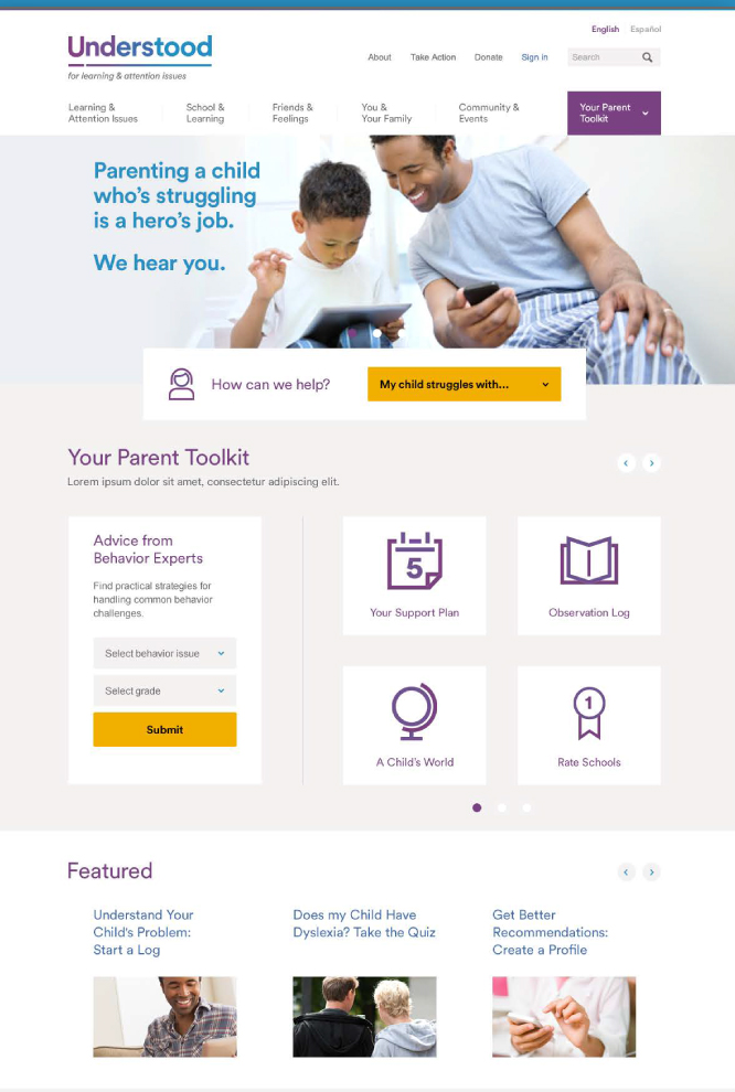
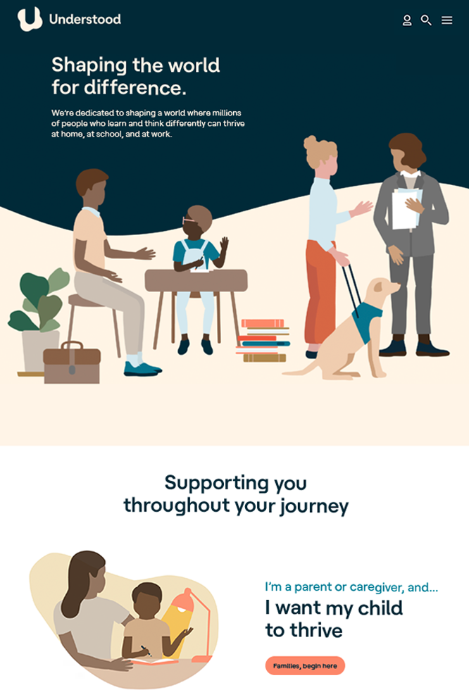
Product page / website before & after launch
We collaborated with our team of UX designers to replace the whole website with bold visual elements and SEO-optimized UI copy.
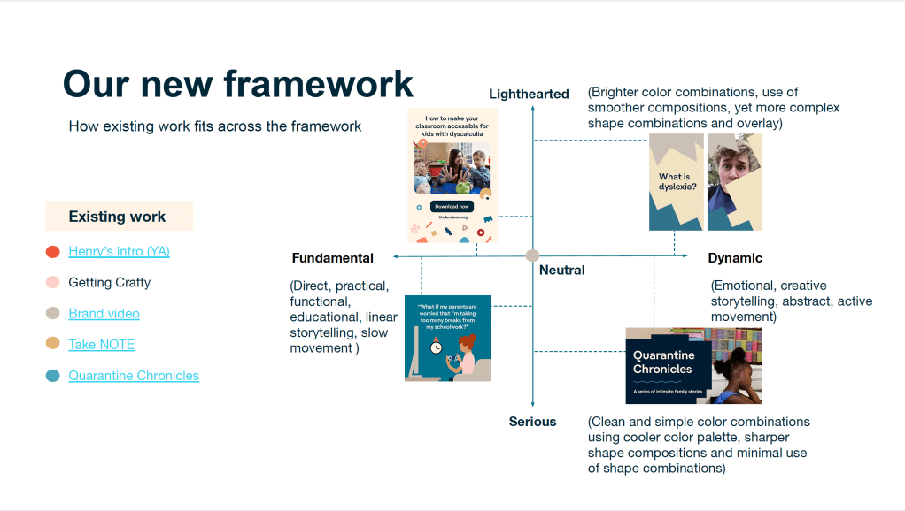
New visual and verbal brand guide framework
Because our new guidelines worked across a large array of products and offerings, a visual and verbal brand guide framework was needed to help inform copy and design decisions. Together with ACD partner, Aksana Berdnikova, we created this framework using x/y axis to demonstrate how to diversify Understood’s existing verbal and visual brand assets, all while keeping accessibility in mind.
Once intended audience was established, the framework was used to determine how new work would be created. By plotting the type of content needed to be created and the tone needed to be conveyed within that content, teams were able to create distinct brand territories and launch concurrent multi-channel messaging while maintaining the brand’s ethos in distinct but cohesive ways.
This framework helped simplify copy and design decisions for the team and clarify future implementation.
Client: Understood.org
Branding agency: Wolff Olins
Sound agency: Listen
Typeface designer: Martin Vácha
Illustrator (for initial library build): Ka Young Lee
Roles: Branding, Creative Direction, UX/UI Copywriting
